 |
 |
| Add caption |
1. Daniel, Danielle. (2015). Sometimes I Feel Like a Fox. Toronto, ON: Groundwood Books.
I counted the days until this book arrived in late July. Danielle Daniel, a mixed media artist and writer, created this text for her son, Owen. She wanted him to know of the Anishinaabe tradition of totem animals. Each two-page spread features a totem and a brief poem that describes the animal clan. For example, for the wolf she writes:
Sometimes I feel like a wolf,
intelligent and loyal.
I surround myself with family
and howl into the moonlight.
I imagine using this text with students as both a writing and visual arts mentor text. The four-line poems that accompany each animal totem make for patterned writings that could be emulated. The art inspires mask making. Here is a link to an earlier post that outlines making papier-mâché masks with students that I did with elementary students in New York. It's a beautifully messy process and well worth it.
 |
| from Sometimes I Feel Like a Fox |
 |
| Pages from Wild Berries by Julie Flett. |
 |
If I were teaching with this text, I'd be tempted to talk with students about mining the necessary--how we do that as artists, as writers. What is it in our art that is merely decorative? What is it in our art that is mostly like breathing? How might we (un)clutter the two?
 |
You can see more of Flett's text here. Flett’s images were made using paint, ink and collage--a mixture of traditional and digital arts.
 |
| Images from Roberto Innocenti's Rose Blanche. |
3. Gallaz, Christophe. (1985/2011). Rose Blanche. Illustrations by Roberto Innocenti. Mankato, MN : Creative Paperbacks.
There's considerable tension in Innocenti's use and placement of red in Rose Blanche. Set in a small town in Germany during WWII, this is a grim story told through a child's point of view of her home town and the child's inability to fully grasp the realities of the Holocaust. Rose dons a red ribbon in her blond curls--a poster child for the Aryan race. She is excited to see the soldiers departure (to the Eastern front) and she stands holding a Nazi flag. She is an innocent who will later learn about the pajama-clad children, young like her, but gaunt and pale and kept beyond the edge of her town behind barbed wire. She will learn of them by following a lorry that is bringing a boy she saw in town to the camp. It is here where she will sneak food to the starving children, kneeling in the white snow and also where she will die, caught in crossfire.
Against the muted, sepia-tinted illustrations, the only red to rival Rose's hair adornment are the Nazi flags and armbands--surely an iconic image of evil. The use of the same color to represent both innocence and evil heighten the narrative tension. If I were to use this book with older students I would ask them about the use of the same color to represent a strong contrast, such as innocence and evil. How are innocence and evil related? How are they foreign to one another? Are the roles of victim, perpetrator, bystander exclusive? Do they bleed into one another?
I would also be curious as to what understandings students compose when they consider that this picture book is historical fiction. How does the genre constrain and liberate the artist? The author? What fictions are being told here? What truths? Whose?
On a side note, I'd want students to know that Innocenti is a self taught artist who left school at 13. His realistic paintings, often described as photo-like, are monochromatic toned with full color accents.
4. Geisert, Arthur. (2013). Thunderstorm. Brooklyn, NY: Enchanted Lion Book.
In this wordless book, apart from timeline which runs at the bottom of each spread, Arthur Geisert captures with meticulous details a midwestern thunderstorm. It's an oversized book which I suspect matches the big sky bigness of the midwest and against that ever darkening blue-black, the bits of red ground us to the earth and the narrative.
Place matters. As does color.
If I were using this book with students I might want to talk about telling a story from the place that is known and using a dominant color like red to ground the narrative. Geisert now lives in Iowa. He lives this landscape and yet, I imagine as in most art, it is through the making that Geisert names some new truths about his local landscape that he simply could not have understood prior to making his art.
I think here about the advice Sherwood Anderson gave William Faulkner and would want to share it with students and see what they make of it:
Geisert created copperplate etchings that he pressed and then colored with watercolor. An impressive telling. Here's a link to a brief story about Geisert and his art and book process.
5. Krishnaswami, Uma. (2013). The Girl of the Wish Garden, A Thumbelina Story. Illustrated by Nasrin Khosravi. Toronto, ON: Groundwood Books.
I never liked Thumbelina. Out of all the Hans Christen Anderson fairy tales, I disliked that story the most. Even as a young child, I found it hard to admire given the absence of agency for girls. Thumbelina waited to be rescued. So it was all the more delightful to read Uma Krishnaswami’s The Girl of the Wish Garden: A Thumbelina Story, as female agency is restored. Instead of waiting to be saved, Lina figures it out for herself and calls forth the fish to help her. Alongside this more feminist tale that is told through poetic voice-- are the breathtaking illustrations by Iranian artist, Nasrin Khosravi, for whom the book is dedicated. Lina's red watery gown shot through with bits of gold creates an ethereal world that begs the viewer to enter. At times I am reminded of Chagall's works. Here, red is elemental and royal. This is what enchantment sounds like and looks like.
Krishnaswami created the poetic text in response to Nasrin Khosravi’s illustrations. If I was using this text in class, I might invite students to try their hand at writing an original tale based on a set of images they found compelling in some manner. You can hear how the writer inserts herself into the tale at its opening:
 |
| from Rose Blanche |
Against the muted, sepia-tinted illustrations, the only red to rival Rose's hair adornment are the Nazi flags and armbands--surely an iconic image of evil. The use of the same color to represent both innocence and evil heighten the narrative tension. If I were to use this book with older students I would ask them about the use of the same color to represent a strong contrast, such as innocence and evil. How are innocence and evil related? How are they foreign to one another? Are the roles of victim, perpetrator, bystander exclusive? Do they bleed into one another?
I would also be curious as to what understandings students compose when they consider that this picture book is historical fiction. How does the genre constrain and liberate the artist? The author? What fictions are being told here? What truths? Whose?
On a side note, I'd want students to know that Innocenti is a self taught artist who left school at 13. His realistic paintings, often described as photo-like, are monochromatic toned with full color accents.
 |
| from Thunderstorm by Arthur Geisert. |
In this wordless book, apart from timeline which runs at the bottom of each spread, Arthur Geisert captures with meticulous details a midwestern thunderstorm. It's an oversized book which I suspect matches the big sky bigness of the midwest and against that ever darkening blue-black, the bits of red ground us to the earth and the narrative.
Place matters. As does color.
If I were using this book with students I might want to talk about telling a story from the place that is known and using a dominant color like red to ground the narrative. Geisert now lives in Iowa. He lives this landscape and yet, I imagine as in most art, it is through the making that Geisert names some new truths about his local landscape that he simply could not have understood prior to making his art.
I think here about the advice Sherwood Anderson gave William Faulkner and would want to share it with students and see what they make of it:
“You have to have somewhere to start from: then you begin to learn,” he told me. "It don't matter where it was, just so you remember it and ain't ashamed of it. Because one place to start from is just as important as any other. You’re a country boy; all you know is that little patch up there in Mississippi where you started from.” (from here)This advice helped Faulkner to shift from telling stories about a war to telling stories about his home landscape of Mississippi. There are all kinds of knowing and all of them are incomplete. I'd be honored to help students understand that often we write and make art to name what we almost know, what we mostly forget. I'd love for students to create texts (visual and/or written) of what is local to them like Geisert has done: A small slice of life at a particular time. Mining the local is far more important than any set of national or state standards.
Geisert created copperplate etchings that he pressed and then colored with watercolor. An impressive telling. Here's a link to a brief story about Geisert and his art and book process.
 |
| from The Girl of the Wish Garden |
I never liked Thumbelina. Out of all the Hans Christen Anderson fairy tales, I disliked that story the most. Even as a young child, I found it hard to admire given the absence of agency for girls. Thumbelina waited to be rescued. So it was all the more delightful to read Uma Krishnaswami’s The Girl of the Wish Garden: A Thumbelina Story, as female agency is restored. Instead of waiting to be saved, Lina figures it out for herself and calls forth the fish to help her. Alongside this more feminist tale that is told through poetic voice-- are the breathtaking illustrations by Iranian artist, Nasrin Khosravi, for whom the book is dedicated. Lina's red watery gown shot through with bits of gold creates an ethereal world that begs the viewer to enter. At times I am reminded of Chagall's works. Here, red is elemental and royal. This is what enchantment sounds like and looks like.
 |
| from The Girl of the Wish Garden, A Thumbelina Story. |
In a land of dreams,
where time itself
can shift and change,
I once saw this tale unfold.
The child was named Lina.
Her mother had found her in a silken flower
in a garden of wishes, where the birds sang wild
and the winds blew free.
As Lina's tears ran dry.
an old wind tune crept
into her mind. She sang:
"Wind-swish, bird flutter,
fish-bubble and all,
come to me now,
come when I call."
In answer, the pond grew thick with curious fish.I'd be interested in students thinking about how authors and artist recast the text. How does Krishnaswami do this here? How is Lina different from Thumbelina? Which words show that? How is Lina visually portrayed? How is that sense of agency conveyed visually? I also would not be adverse, to invite students to create the images based on a compelling narrative--a text that matters to them. Asking students to think about the medium matters. I outlined this process in an earlier post about creating digital stories. I wrote there:
Lina showed them how to snip and where to chew,
and soon they cut the leaf free of its stem,
so it floated like a raft.
"This film I made in a tenth grade classroom a few years ago. I made the images first, using newspaper and white and black gesso. The idea was to demonstrate to the high school students and their teachers that story can begin with image..."This is a book to dwell in. How do we make art that invites dwelling? This is a book I would share with children of all ages.
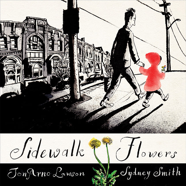 |
In this wordless picture book a father and daughter walk home and the little girl collects wild flowers. Her father is distracted, talking on a cell phone and doesn't notice what she is doing. The father sees the grays of the city, while the child's view is decidedly different. She notices the flowers--weeds to many--growing through the cracks of the sidewalk and picks these bits of color that she will gift to a dead bird, a dog, a homeless man and eventually to her family. It's this gifting that matters so by the little girl dressed in red.
Initially, the story is told in black and white with bits of color here and there. Red shows up immediately and heightens the difference between the black and white world and the world with color. However, as the story progresses and the child picks more and more sidewalk flowers and gifts these, color emerges. I'd be curious as to what students make of these shifts in color. What does this convey? Is this a visual metaphor?
There's a backstory to this book that the author tells in a blog, Sidewalk Flowers - Telling a Story without Words. It's an important post as Lawson describes what prompted him to imagine the story as wordless. I'd like to share that back story with students and invite them to consider telling a story without words. This isn't something I'd want to order up like a burger at a diner. Rather, I imagine it as invitational--asking students to seize the moment if such moments arrive. I also would be curious to engage students in a discussion about the ways authors and artists notice/note and observe and how these can be similar and different stances.
Here's a link to Sydney Smith's portfolio.
 |
| from About Two Squares... |
This is the story of two squares--one black, the other red, who take on the mission of rebuilding the world. This visual fable, first published in 1922, is anchored by the Russian art movement of suprematism, at that time a new concept of art that rejected all reference to the physical world in favor of geometric forms. The book at that time was intended for children.
 |
| from the original Russian text |
Don't read this book Take --Reading isn't a passive act. It is full body. Physical.
paper. . . .fold
rods . . . .color
blocks of wood . . . .build
 |
| After chaos, red emerges and resettles the world. |
Here is a link to a digital version of the Russian text from MIT.
 |
| This is the ending of the text from the newly released Tate Museum version. Notice the and then... |
cover.jpg)
8. Miyakoshi, Akiko. (2015). The Tea Party in the Woods. Tonawanda, NY: Kids Can Press.
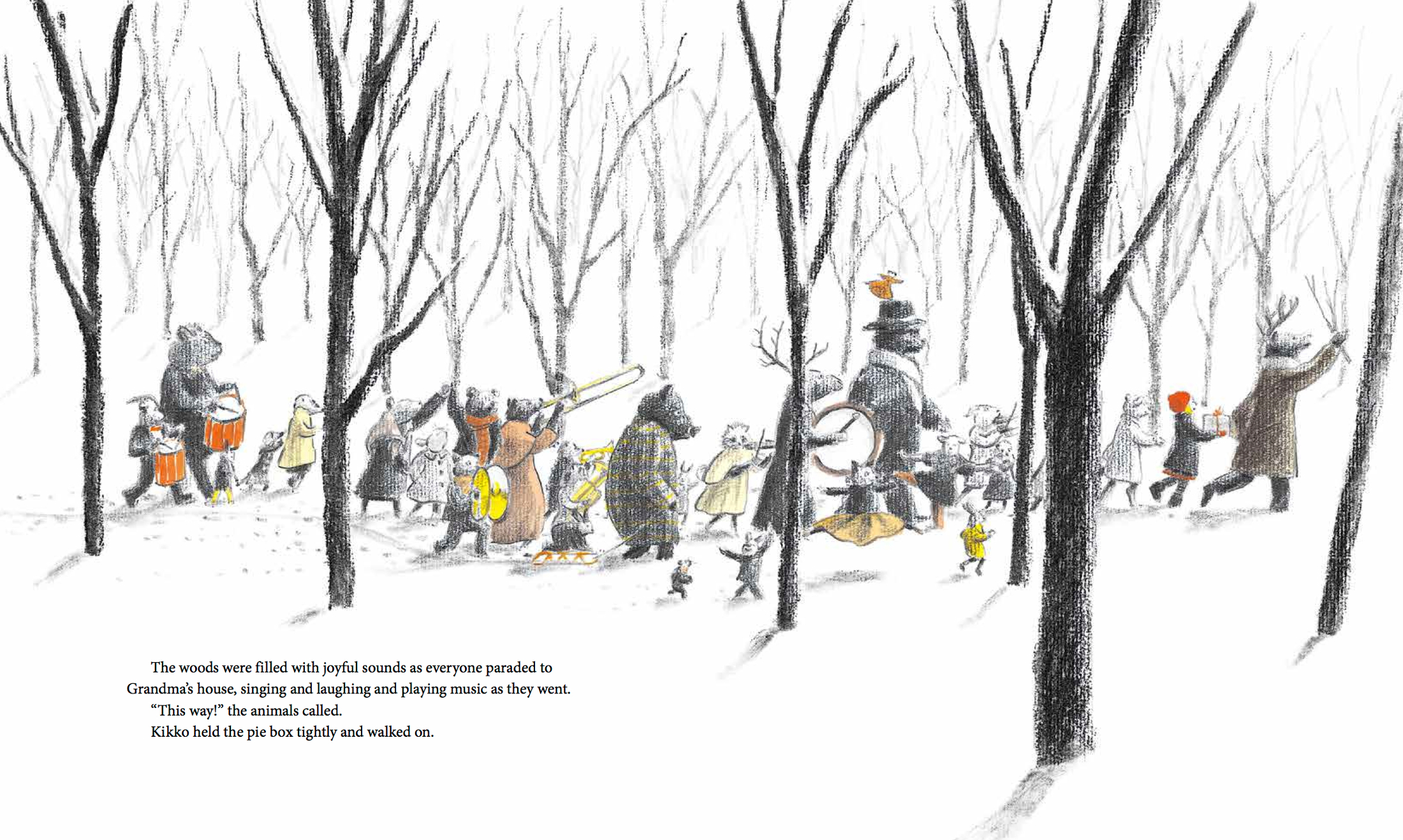
Both haunting and inviting. This picture book originally published in Japan makes use of the color red in dramatic ways. A little girl, Kikko, attempts to bring a cake her father forgot to her grandmother who lives on the other side of the woods. And like many fairy tales, there are always woods. As she rushes through the woods she comes to a large house and enters into a world somewhat akin to Alice in Wonderland. Here too there is a great tea party of a very different sort--one that is happening among the forest animals who quickly befriend the little girl. There is no Queen of Hearts lurking here.
However, there are multiple lessons about kindness and love and something too about hope.
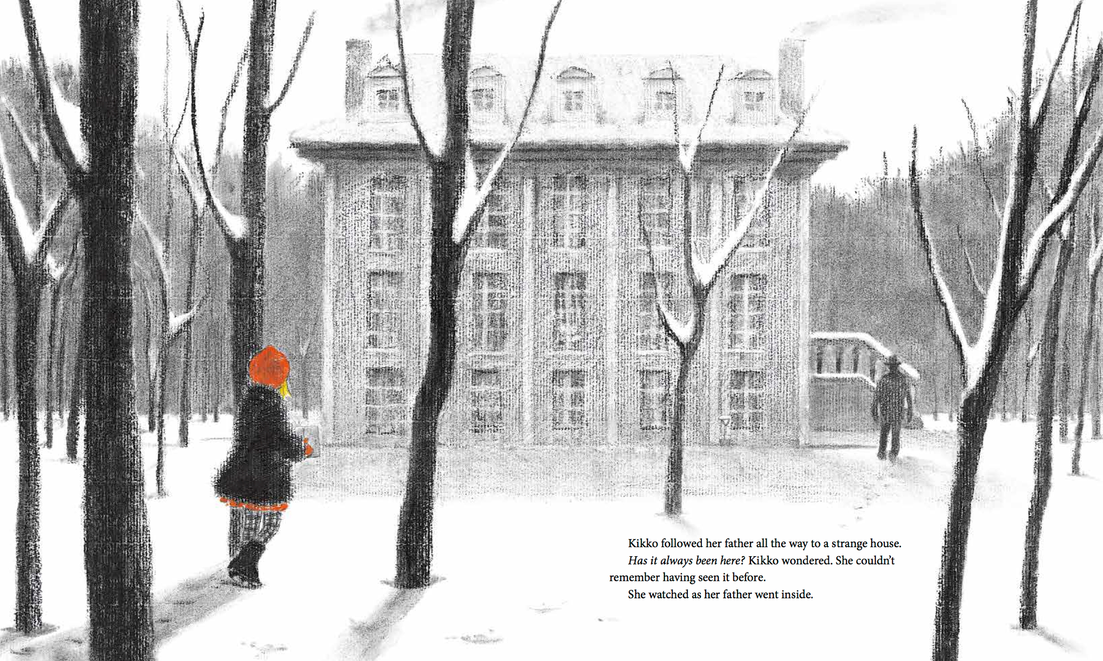 |
There's something so elemental about charcoal, yes?
Here's a link to a quick video that outlines how to draw with charcoal pencils.
Here's a link to a wonderful post about using charcoal with kids.
 |
| from The Tea Party in the Woods |
9. Montileaux, Donald F. (Oglala Lakota Nation). (2014). Tasunka: A Lakota Horse Legend. Translated by Agnes Gay. Pierre, SD: South Dakota State Historical Society Press.
 |
| from Tasunka: A Lakota Horse Legend. |
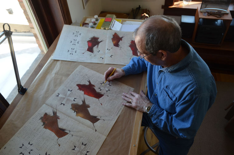 |
| Donald Montileaux, author of “Tasunka: A Lakota Horse Legend,” works in his studio in Rapid City on an image of American Bison. from here. |
It took Montileaux three-years to create the book. I think it is important for students to know that the art making process as author and artist can be a lengthy one. Montileaux created the art for this book using ledger art style and worked with pencil, ink and pastels. Traditional ledger art used watercolor, pencil and ink, however, Montileaux achieved the boldness of color in the text through his use of pastels.
I'd love to use this book as a mentor text for students to learn about ledger art--both its history and how the ledger art style is used today. Ledger art (1860-1910) is a genre of art created by 19th century Plains Indian men who used watercolor, pencil and ink to create drawings on old ledgers (accounting books) often to record/represent their history as warriors, hunters and suitors. Today, the art genre continues. Historical works have been digitized and compiled. Some can be seen here. It is estimated that more than 200 ledgers exist.
 |
| from Peggy: A Brave Chicken on a Big Adventure |
10. Walker, Anna. (2014). Peggy: A Brave Chicken on a Big Adventure. New York: Clarion Books.
 Peggy is a chicken out for a bit of fun one day in her backyard. She's talking with pigeons and then jumping on a trampoline when suddenly a big gust of wind transports her from her suburban backyard to a street in a city. Peggy does what most would do: she goes for a walk. Peggy is a flåneur in the city and a rainy one at that. By following familiar nature, such as sunflowers and pigeons, Peggy finds her way home. There's a moral somewhere in all of that we might want to pay attention to.
The reds used here are muted. In almost all of Anna Walker's books, red is understated and powerful. Walker uses ink and photo collage to create the illustrations. Here's a link to her website where she shows her creative process while making Peggy.
I think I would like to introduce students to the idea of using photographs as a source for the visuals in a text like Walker does. What's the setting of the story you are telling? Can you make photographic images of the setting? What happens when you post those images closely together. What do you begin to see? Can we use software, like Photoshop, to transform the photographs into line drawings? Could we print them and then use more traditional arts like watercolor or pan pastel to color the illustrations?
Such fun.
Post Script
 I wanted to include The Bear and The Piano in this post based on what I have seen on line. But the book is not yet published. What I have seen though raises a big Wow! I couldn't wait until next April to get David Litchfield's debut picture book when it will be published here in the US, so I ordered a copy from London and it will arrive early September. Here's the information on the text:
Litchfield David. (2015). The Bear and The Piano. London, UK: Frances Lincoln.
So what books make you see red?


I LOVE this list!!! When I saw it, the first thing I thought of was The Red Book by Barbara Lehman (which is a wordless picture book). Now I have to get the books in this collection!
ReplyDeleteThanks Heidi. There are lots and lots of books with red as a featured color. I had forgotten about Lehman's book. I loved it when I first saw it. I also thought about Journey but figured that was so well known. Both are lovely though.
DeleteOh I love this! I must get Sometimes I feel like a Fox for my classroom! It is going to the very top of my wishlist. I already own 4 other books on this list. Dolphin SOS was such an incredible book to share as a read aloud. Beautiful, beautiful books all around!
ReplyDeleteI'm building a unit of study around Dolphin SOS. Thanks Carrie for taking a look:)
DeleteMary Ann,
ReplyDeleteWhat an interesting way to frame your #pb10for10 list. I've never been a fan of the color red, but I must admit you have made me see it in a different light. Thank you for taking the time to not only share the stories, but a bit about the art used in each picture book. There are many "new to me" titles here. I look forward to checking them out. (By the way, clever move to order from London.)
Cathy
Thanks Cathy:)
DeleteI just requested from the library most of the titles you mention here. I am so excited!
ReplyDeleteI am so glad the texts resonated. I just read The Bear and the Piano. Fabulous story and amazing illustrations. IT is available now in England and will be available in the US in early April 2016. One to add to your list.
Delete