I thought in this post I would show a few pages of current art journals where I try out ideas, colors, shapes, movement, collage, brush marks, companion pages, rough painting, mark makings, mixed colors, abstracts, and the use of mixed media. What these pages have in common is that they are unfinished and did inform more finished works.
I plan to begin working in a concertina journal tomorrow to explore how ideas cross pages.
 |
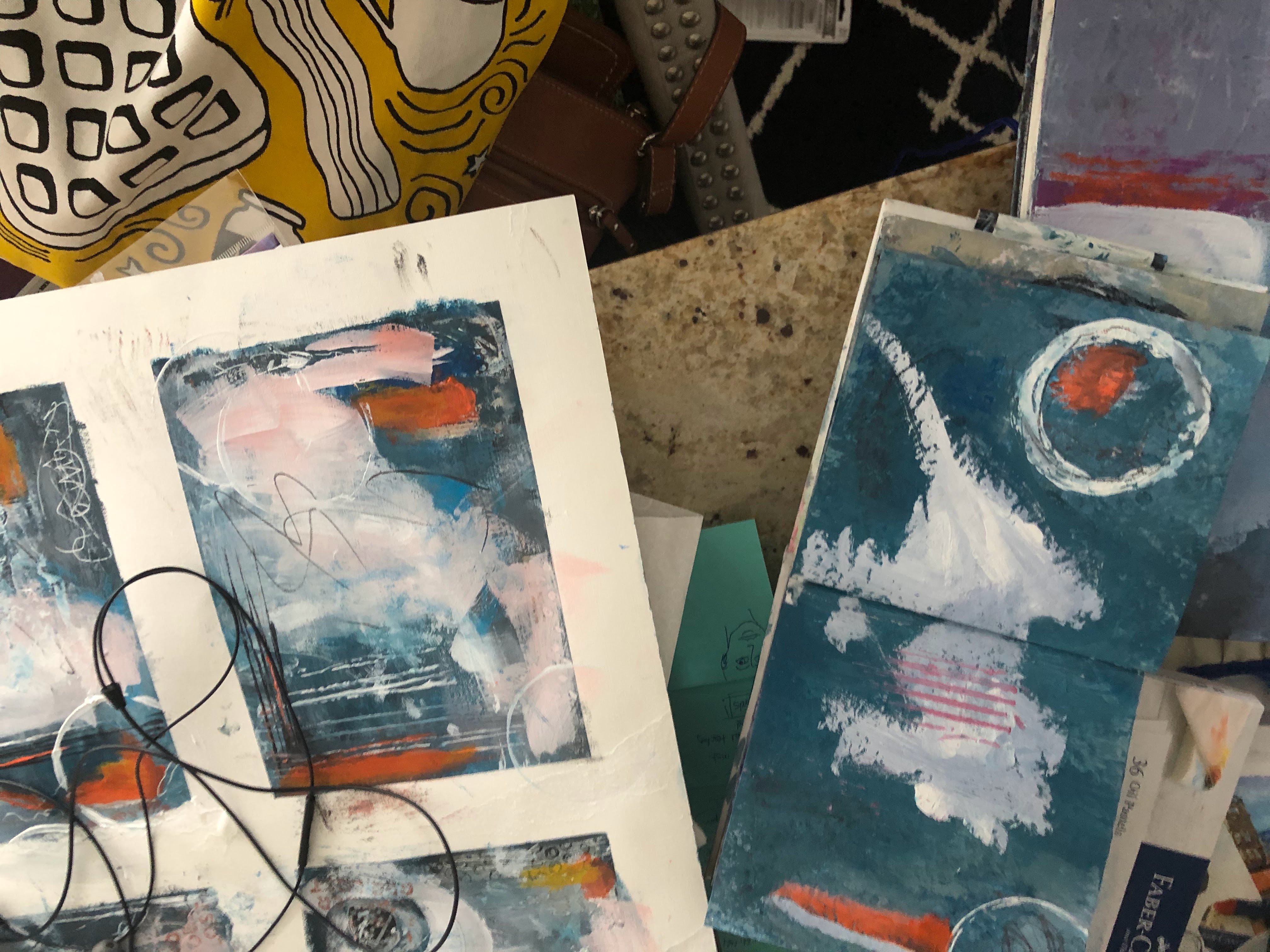
| Two journals I am working I often at the same time. The larger journal shows a 2-page spread (you can see earlier work on the pages below) and a smaller square watercolor journal with very heavy paper. Working back and forth across the two pages and in another journal helps me to be patient. |
 |
| A page in a 8 1/2 x 11” watercolor journal. This is the facing page to the page below. |
 |
| Facing page to the one above. I like the blocks of color on this page. |
 |
2-page spread: limited palette with collage papers. These pages are too light. Hard to know where to look. I am drawn to the the block of dark blue on the bottom left page.
|
 |
| A large watercolor sheet and a smaller watercolor journal. In both I play with a similar color palette. |
 |
These are two pages page where I got lost and could not find cohesion. I do wonder if sections of these two pages might work better. I do like small sections, like the horizontal white lines.
|
 |
A journal page where the color mixing got away from me. Way too busy. I have let this sit. This started loose and then got very, very tight. I do like the black mark making on the upper left side.
|
 |
Trying out dominant, vertical orange mark with very limited palette and lines. This is a motif I keep returning to. Experimented here with making marks into the wet paint.
|
 |
Collage page on a paper with found papers including dress pattern, tissue paper, primary yellow, primary magenta, white and black. Not my usual colors. I love the little block of pink.
|